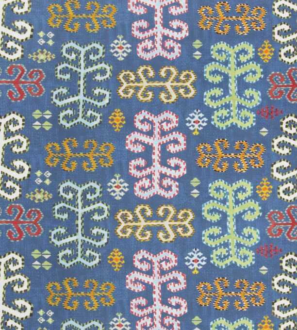
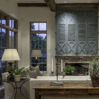
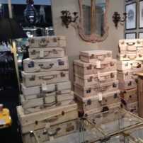
Last month, we talked about how rhythm plays a role in design. Today, we’re contemplating the importance of texture and pattern as we pull together several schemes for clients.
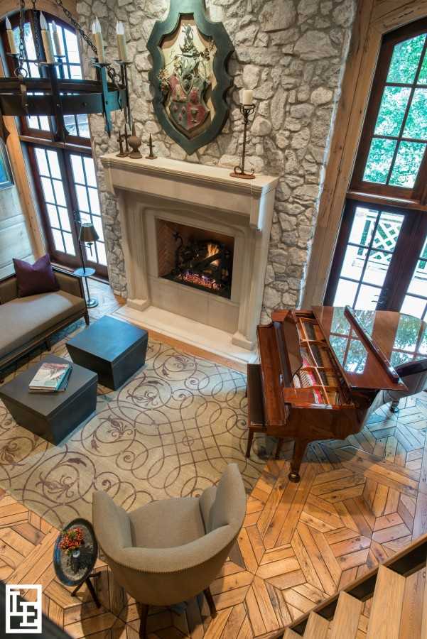
Texture and pattern are your friend. Here, the patterned wood floor, patterned rug, and textured wall behind the fireplace make this grand room feel warm and cozy.
When selecting fabrics, texture and pattern are at the forefront of every designer’s mind. How we see texture depends on several factors – like lighting and distance from the object, as well as the textures surrounding the object. A rough fabric will look especially rough if next to something as smooth as silk, for example. Without pattern, a room can feel one-dimensional and lackluster. Because selecting the right patterns for a space can be challenging, designers have to be open to trial and error as they play with different options. As always, let’s define these terms:
texture (n) /ˈteksCHər/
The feel, appearance, or consistency of a surface or a substance; the character or appearance of a textile fabric as determined by the arrangement and thickness of its threads.
pattern (n) /ˈpadərn/
A repeated decorative design.
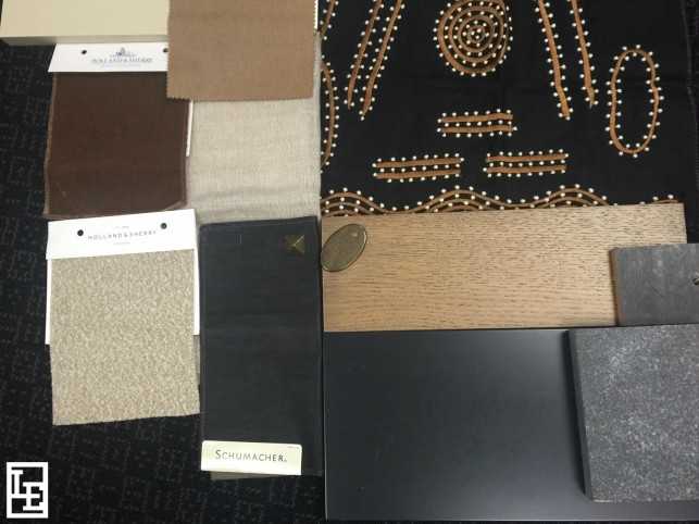
We’ve been busy scheming away!
Texture and pattern are inevitably at the forefront of the fabric-shopper’s mind. If using a smooth fabric, the right pattern becomes the star of any upholstered piece. If using a solid, texture is key. Using a variety of patterns and textures within a room, as well as strategically repeating them, is one of the most important aspects of designs. One of our favorite stages of design is scheming until we find the right palette of pattern and texture to bring to life the space we’ve envisioned.
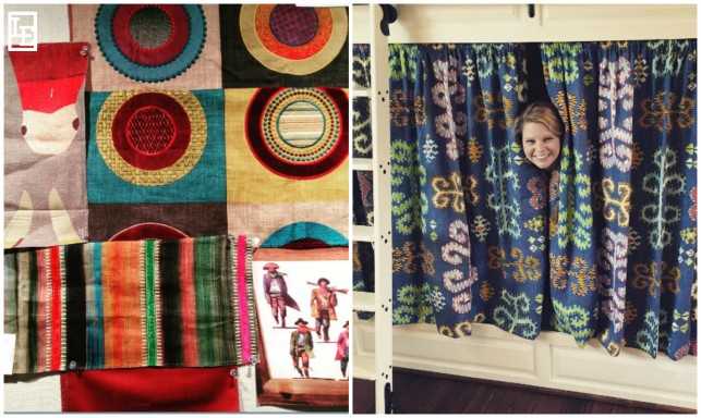
Right: Laura Beth peeks out from behind Jim Thompson’s “Karapinar” in Riviera.
Bunk rooms, for example, are one of our favorite places to play with pattern and color. In one client’s scheme shown above (left), we had fun with the “Western” theme by adding saturated hues and a pattern of circles that packed a punch. On the right, a brightly colored Jim Thompson fabric became a recurring pattern throughout this client’s duel purposed bunkroom/playroom, adding vibrant movement to each bunk’s niche as well as the oversized ottoman.
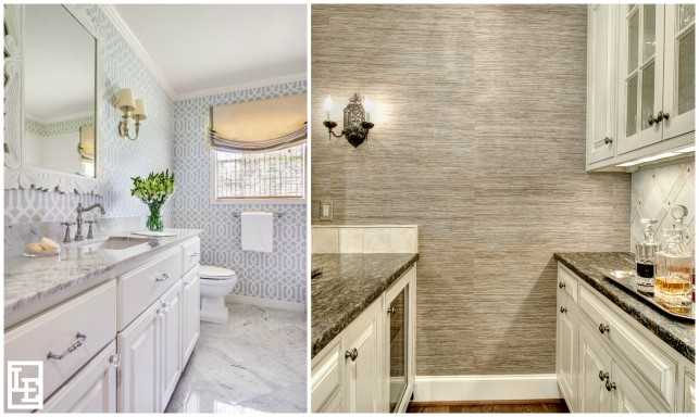
Left wallpaper: Schumacher’s “Imperial Trellis” in Soft Aqua.
Pattern does not have to be bold or funky to give a room movement, nor does texture need to be extreme to be successful. Above left is an example of one of our favorite wallpapers, which subtly transformed this bathroom into a chic and cheerful space. Adjacent, warm, textured wallpaper gives subtle interest to a client’s bar, pictured above (right).
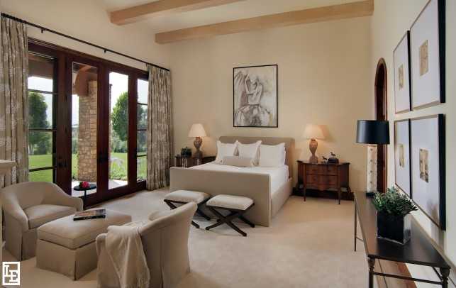
When you want to shy away from bold and colorful patterns, texture is your best friend. Neutral is never boring when a variety of textures are used. Mix it up! Upholstering every single piece in the same favorite fabric will make a room feel lifeless. Fine Belgian linen and plush mohair, rough shagreen and soft chenille – mixing textures is what makes a neutral room come alive.
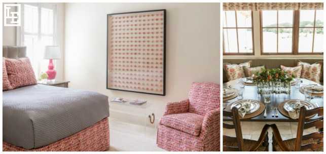
In both spaces above, the same pattern is used in multiple ways, which creates a cohesive design. Fabric used on the right: Jasper’s “Indian Flower” in Pink/Green.
Repeating the same pattern throughout a room is a reliable way to achieve cohesiveness. Above left, a playful fuchsia and orange patterned fabric brings harmony to this engaging teenage girl’s room, pulling together the bed skirt, pillows, and chair. Find a pattern you love and build the room around it; here, the playful print was our inspiration for the oversized wall-hung work of art, made up of pink sea urchins. Three-dimensional art is a great way to add interesting texture to a space, too.
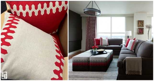
Likewise, above, custom Amelie pillows with white and red trim echo the quartet of ottomans, tying together the media room and establishing a distinct color scheme.
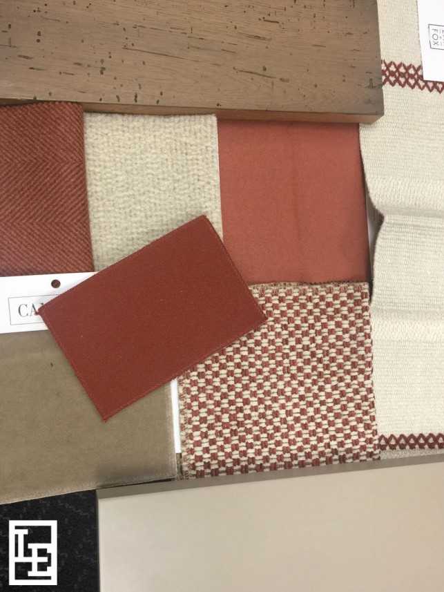
See a fabric you love? Send inquiries to info@lucaseilers.com.
Above is one scheme of texture and pattern that we love right now. What are your current favorites? Stay tuned – next month we’re exploring our friend Vicente Wolf’s book The Four Elements of Design: Interiors Inspired By Earth, Water, Air and Fire.
Great blends of pattern, like great dishes, must be carefully tasted. And constant tasting is what teaches a cook how to taste. – Billy Baldwin

