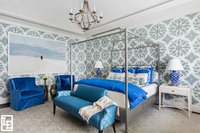
Rich blues are synonymous with royalty and elegance, making this master bedroom, with its bold use of cobalt, fit for a queen.
While some of the elements and principles of design are harder to discern, color is one that people of all ages easily recognize and appreciate. From the time we can form words, we’re asked, “What’s your favorite color?” Because of this, it seems we’re trained from childhood to notice color before anything else.
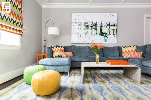
Pops of bright orange, yellow and lime green give vibrancy to this client’s cheerful play room.
We might not instantly identify the subtle pattern play of fabrics, or the scale and proportion of the art on the walls, but most people would agree that our eyes pick up immediately on the dominating colors of a room.
Because color is so closely related to emotion and mood, it is easily one of the most important aspects of design (and one of our favorites). Color can be so powerful that it influences unrelated perceptions, such as how our food tastes.
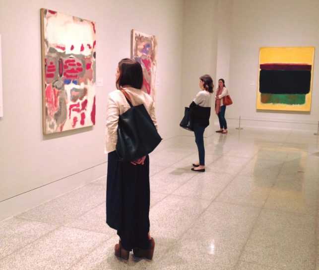
The team at Lucas/Eilers visited the Museum of Fine Arts Houston to view Mark Rothko: A Retrospective back in October, and we were inspired by the way his use of color affects the viewer’s emotion.
Color psychology shows that the palette of a room can directly affect our behavior and disposition. When you think about how a stark white doctor’s office makes you feel compared to a red velvet covered theater room, it’s clear how color (or lack thereof) can play an enormous role in design.
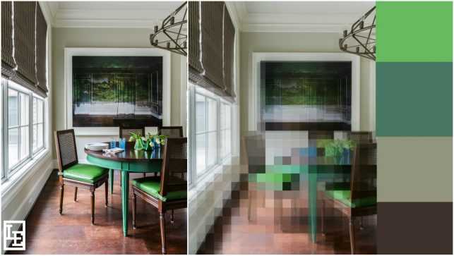
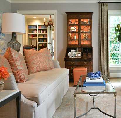
By pixelating this image of a client’s breakfast room, it’s easier to see the main four colors used within the space; varied tones of green brighten up an otherwise neutral palette.
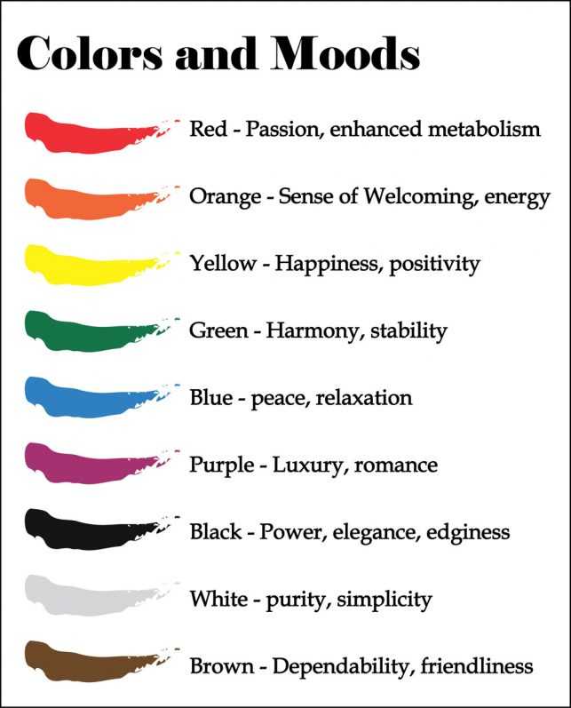
According to the color chart, this client’s breakfast room conveys feelings of harmony and dependability – an ideal environment to begin the day.
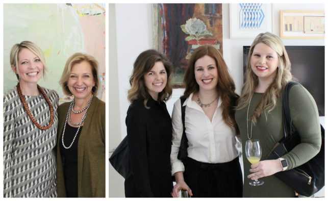
Left to right: Professional colorist Sara Eliason with Sarah, Aileen, Linley and Laura Beth.
In February, we had the pleasure of meeting local designer and professional colorist Sara Eliason at an event hosted by FOUND. Picking the right hue for a space is Sara’s passion and talent – she recently gave a TED talk on the topic. In her talks she explains how the use of colors within design isn’t just superficial – it affects how we live our lives.
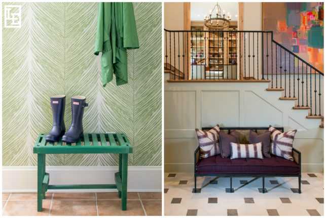
Left: Mudrooms, laundry rooms, and powder baths are a few of our favorite places to experiment with bright and playful colors. Right: Using a variety of bright color within a space can still be sophisticated, as seen in this client’s entry.
Sara believes that everyone has a unique color palette that suits them – and we agree. When we begin the design process for a new project, choosing the right colors is central to making the client’s house feel like home.
“Beige is atmosphere. It’s bisque, it’s ivory, it’s cream, it’s stone, it’s toast, it’s cappuccino. It’s, well, it’s magic.” – Albert Hadley




Beautiful work ladies! Such skillful and sensitive advice on a vast topic. Thanks too for the shout out. Xoxox!