Happy spring! Last month, we explored Scale and Proportion within design. Lately, inspired by the arrival of springtime, we’re listening to the songs of chirping birds in the trees and thinking about rhythm. We’ll start by defining rhythm within design.
rhythm (n) ˈriT͟Həm/
The flow of elements, usually organized according to a scheme such as repetition or alternation,
progression or graduation, transition, opposition or contrast or radiation.
We’ve always thought rhythm was the most confusing of all of the principles. It helps us to think of rhythm as the familiar concept in music as the beat that carries the melody.
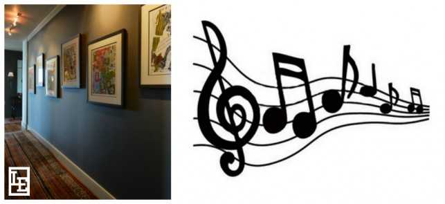
The fun and colorful prints along this hallway remind us of notes on a scale.
In interior design, you can think of rhythm as the principal that carries the eye along a path found in the repetitive use of color, pattern, texture, line, etc…
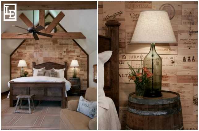
When you start to analyze interiors that feel “successful”, rhythm is all around.
Architectural details do a great job of creating rhythm such as the steps of a staircase, the division of window panes, or; for example, the ceiling beams in this guest house of a farm near Brenham. You can also see a rhythm to the blades of the ceiling fan, stripes in the rug, and the slats of the wooden blinds.
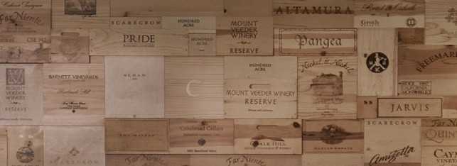
But one of our favorite examples of rhythm in this room is found in the decorative pattern on the wall behind the bed above. The 1st floor of this free standing guest house is all climate controlled wine storage. So for the guest suite on the second floor, we worked with our wine enthusiast clients to create a focal point by arranging the end panels from crates of their favorite vintages on the wall behind the bed which; even with their random sizes; provide rhythm.
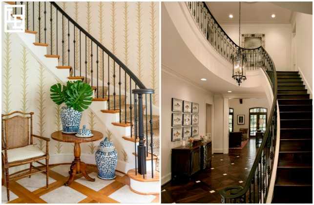
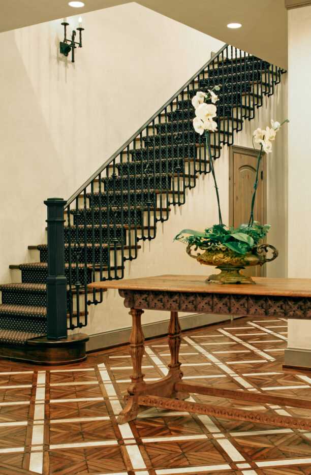
Decorative metal stair railings add interest to a foyer and create a rhythmic path for the eye
to travel.
In the photo above on the left, rhythm can be seen in the wallpaper stripes and in the stair railing design. In both spaces, our eyes naturally follow the curve of the railing up and around, thanks to the repeating and alternating patterns of the metal bars. It’s something we might not even realize is happening, but it’s a key element of design that works to make a room feel cohesive and complete.
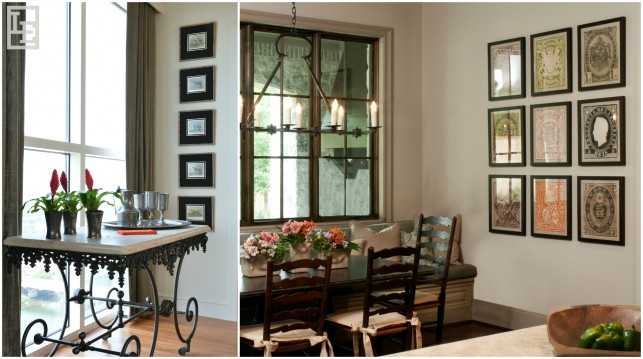
Rhythm is rather easy to achieve; the simple act of hanging art together on the wall with equal
spacing creates rhythm within a space.
Rhythm can be bold and loud in order to call your attention to a focal point, or it can be subtle – you may not even realize it’s there. Just the simple act of hanging a series of same-sized works of art in a row down a hallway is an expression of rhythm. In the same way that we find ourselves tapping our feet to the beat of good rhythm in music, achieving rhythm within the home can be surprisingly satisfying. Our eyes naturally search for repetition, alternation, and gradation – and when we find it, our line of sight flows effortlessly across the room, which is a satisfying feeling for both designer and homeowner alike.
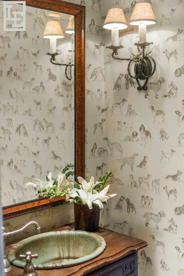
A fun dog pattern in a powder bath is playful while providing movement and rhythm within the small space.
A natural extension of concept is pattern, specifically because when we call attention to repetition or alternation, we’re essentially recognizing a pattern. Next month, we’ll explore the effects of pattern and texture within design. Stay tuned!
“It is in rhythm that design and life meet.” – Philip Rawson


One thought on “Elements and Principles of Design: Rhythm”