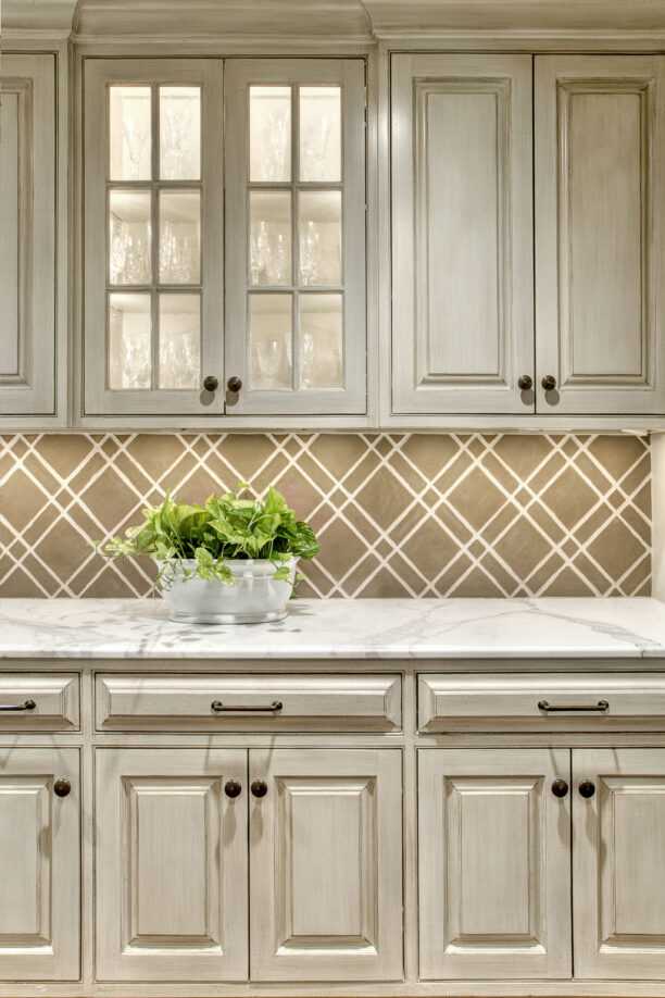
Last month, in our 6th installment of the L/E Journal’s Elements & Principles of Design series, we explored how color can powerfully transform a composition in design. Today, we’re taking a closer look at lines – how they affect our perception of a room, and how they help to delineate different spaces and shapes.
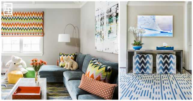
Different types of lines – vertical, horizontal, diagonal, broken, thick, thin, etc. – produce different psychological reactions that influence how we perceive a room. Diagonal lines are more energetic and dramatic as illustrated in two photos above. The playful zig-zags and unexpected broken lines create a more casual-feeling space. We may not even realize it, but our moods can change depending on the types of lines we’re surrounded by.
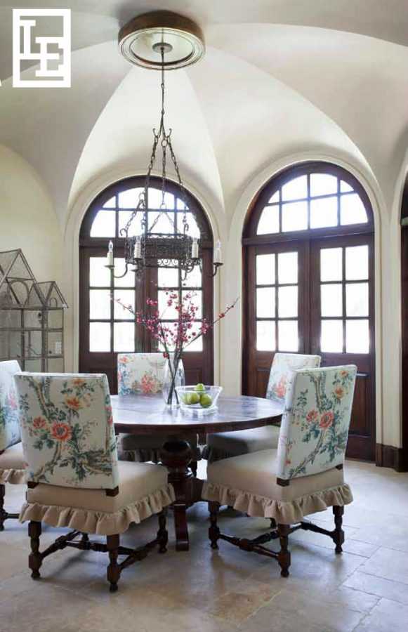
Lines can lead the eye, outline a shape, create a division, and express emotion. Designers often use lines to direct focus, define boundaries, create pattern, rhythm or texture, and give the illusion of depth to a more narrow space. The curved lines of the groin vaulted ceiling in the photo above lead the eye down toward the grand doors and through the rest of the space.
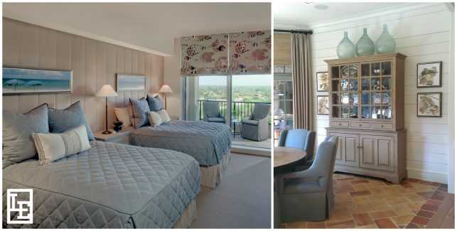
Vertical lines represent strength and alertness. The vertical lines of the channel quilted fabric behind the beds in the photo above stabilize the room and provide a strong focal point. In contrast, the horizontal lines of the painted shiplap wall of the breakfast room shown above express restfulness and serenity. Perpendicular lines create equilibrium between the two moods.
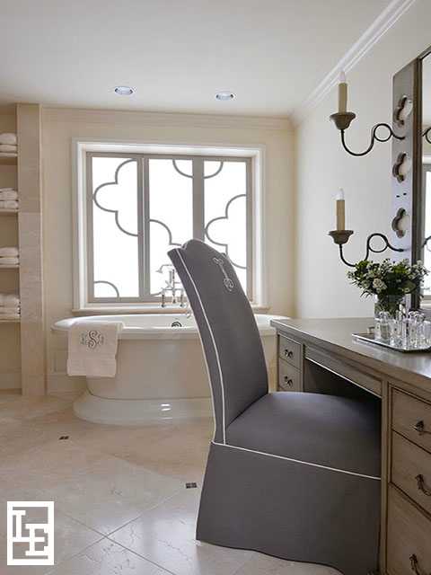
Understanding the different ways various lines can affect our mood can help a designer achieve the look they are aiming for. A masculine mood can be created with thick, straight, solid, sharp, or vertical lines, whereas small spaces and curved lines feel delicate, dainty and feminine. The curves of this master bathroom in the above photo – the arched back vanity chair, the trefoil windowpanes, and the sconces – lend a feminine feel.
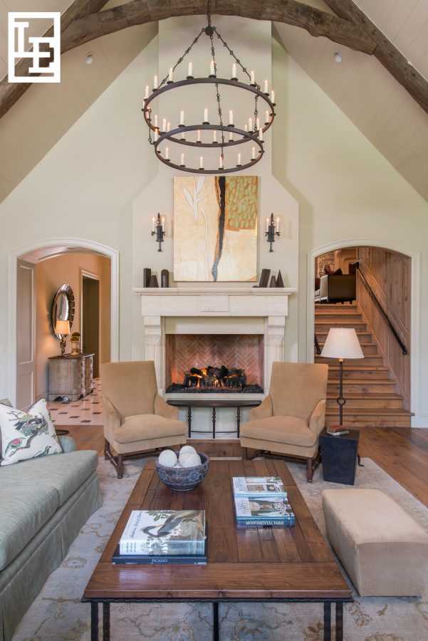
Creating movement by using a variety of lines gives the eye plenty to look at within a space. The project above shows a successful mix of different types of line and form. The diagonal lines of the ceiling and beams, the curved entryways, and horizontal lines of the fireplace lend balance to this grand family room. While it might not be the first element of design that pops out at you when analyzing a composition, line is one that subtly works to direct and lead your eye – something any designer knows is a powerful tool to have. Join us next month as we explore another powerful tool within the elements and principles of design – light.
“Our opportunity, as designers, is to learn how to handle the complexity, rather than shy away from it, and to realize that the big art of design is to make complicated things simple.” – Tom Parsey

